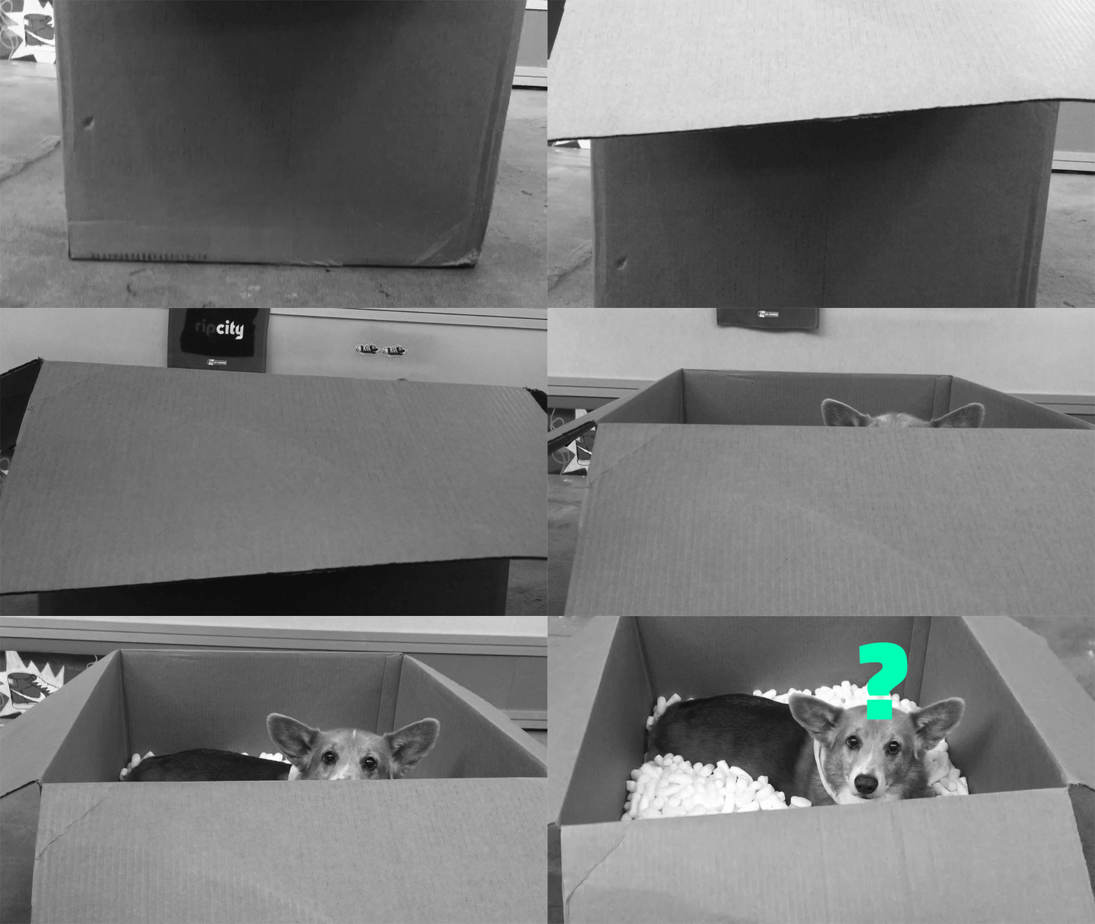
WHAT’S IN A BOX? HOW GREAT PACKAGING EXTENDS THE CONTENTS WITHIN
The last touchpoint before a product is purchased is sometimes the least-considered. But the world’s best brands know their box, bottle or bag is more than a delivery system—it’s what makes or breaks a sale. Here are 10 tips to utilize the power of packaging to make an impact in the one place it really counts—at retail.
1. PACKAGING AND BRAND DESIGN GO TOGETHER
Products take months, sometimes years, from development to market. By taking a timeless approach to packaging design you extend the look and feel of the brand, and ensure graphics will last through multiple retail seasons.
2. AMAZING PACKAGING EARNS MEDIA
One indicator of ROI is to create praise-worthy packaging that gets covered by brand/collector sites as unboxing porn, or is touted by design sites like thedieline.com. Deliver PR product in the original packaging consumers will see.
3. GOOD DESIGN SAVES TIME
People are busy, lazy, and paralyzed by too many choices. Your packaging should help them make an informed decision—from within your product lineup, and when compared to the competition. What’s the main benefit and key features that make your product unique?
4. LESS IS MORE
Assume the decision to purchase started when your consumer went online to do research. Modern packaging doesn’t need to be cluttered (unless that’s the brand vibe you’re going for). If you simply must tout all the wonderful product features and can’t narrow it down, use a QR code on the box, provide retail staff with sales tools as part of your retail program, or try a point of purchase display to put some hierarchy to the information.
5. SPECIAL EDITION SHOULD FEEL SPECIAL
If you’re making the effort to release a limited edition product, go the extra step and create limited edition packaging too. Because distribution is typically focused on core consumers, assume they’ve drunk the proverbial Kool-Aid when it comes to product messaging and information. Emphasize innovative design and premium materials that will be noticeably different than your regular product line so the packaging adds value to the special release.
6. A BOX IS VALIDATION
Packaging is tipping point: the moment your product becomes part of someone’s life. The box should validate the positive assumptions they have about your brand, and complete a circuit based on information and messaging they have encountered along the journey. Thinking to the future, it’s also smart to assume the box will be recycled or discarded, so don’t include the only set of user instructions on the box.
7. MAKE IT REAL WORLD READY
If the product looks trashed before it hits the shelves because the packaging was not durable, it will detract from the sale. Consider how long the product may be on the shelf, and choose materials and a color strategy that ensures it still looks fresh after transit, merchandising, and handling by shoppers.
8. DIFFERENTIATE WITH DETAILS
Just because you CAN use an array of embossed holographic foil stamping and spot varnished soft touch paper stock doesn’t mean you SHOULD. Utilize the bells and whistles if they are brand-relevant or help establish product line hierarchy and wayfinding.
9. GLORIFY THE PRODUCT
Great packaging and retail invites consumers to connect with the product. They can play with the gear, see the colors, feel the textures, or perform a simple demonstration that seals the deal. Work with an expert agency that specializes in creating packaging. Nemo partnered with the Process Agency in Salt Lake on these Goal Zero boxes.
10. PROTOTYPE YOUR PROGRAM
Target stores harnessed the power of packaging using color and consistency throughout the chain to generate a 24% sales jump for their in-house product line, Up & Up. This success started on a small scale first; Target tested an innovative new packaging system in their pharmacies. This success became the blueprint for the storewide rollout of the Up & Up brand.
-
Written by Mark Lewman, Creative Director and Partner at Nemo Design

